Merck SSO
Unifying the account creation and management experiences across the entire Merck ecosystem.
February 2019 | Design, Prototyping, Research
Merck’s different web properties all have different login and account schemes, which causes users to have to remember multiple accounts and passwords. Is there a way to unify all of the different properties under one account?
Project Objective
Unify the Merck ecosystem under one login and account system.
Merck hired us to help address a persistent problem. Merck has a variety of websites, including MerckConnect.com, MerckVaccines.com, MyMerckAccounts.com and others. Each and every one of these websites have their own different registration, login, and account management system, which causes both fragmentation on the Merck database side of things as well as an undue burden on the customer to remember and keep track of all their logins for the different Merck sites.
Merck brought us on to unify the experience of signing up for an account, regardless of which site a customer is on at the time. We called this system Single Sign-On, or SSO.
When I started this project, I thought to myself, “Oh, this should be fairly simple, right? Just a log-in page, a registration form, and we’ll be all done, right?” but I was wrong, as you’ll see, this project was characterized by its complexity.
My role on this project was as the main UX Designer, and aided by Design Lead and later on another UX Designer, Content Strategist, and UI Designer.
Project Kickoff
This project didn’t have a formal kickoff like other projects, but we were given details of the engagement and the vision for what was to come.
Goals: Build a set of “widgets” to be implemented as the new login and account system at Merck.
Budget: Merck gave us enough budget to support about 16 hours a week, give or take, on design.
Timeline: Merck wanted SSO to go into production in April of 2019.
Vision: Users would create one account and be able to access all of Merck’s properties.
Requirements Gathering
Rudimentary wireframes I created to help facilitate conversations about the widgets we would be designing
Due to the complex data-based nature of this project, I worked closely with a Business Analyst at Merck to identify the requirements of what was to be designed.
Our initial discussions led us to aim to design a number of what we were calling “widgets”, which included things like the login screen, registration, editing account settings, and email confirmation.
In order to align closely with what Merck was hoping to get out of our engagement, I and my design lead had a working session with the Business Analyst to discuss her expectations.
Whiteboard sketching from requirements working session
Analog Gathering
Before I dove in on designing this account system myself, I spent time gathering analogs from around the internet.
I found that Google is a strong analog for what Merck wanted to do, which was allow access to multiple properties with just one log in. I also pulled examples from Amazon, who has a large amount of account settings, and Apple, who have a one-page registration page rather than a step-by-step process. I also looked at other pharmaceutical companies’ sites, like Pfizer, to see what the industry around Merck was doing.
Pulling analogs helped me get a sense for the current state of the industry, as well as see examples of helpful design and interaction patterns.
Below are examples of registration pages I pulled:


You can find the entire analogs document here.
Initial Design and Prototyping
One of our key milestones was a quick-approaching meeting with Merck IT, who we would be working with to implement the new SSO system. I was tasked with building out the design of the system and create an Invision prototype to facilitate the meeting with IT.
I created the following screens to create the prototype:


It was at this stage of the project that I started to see the inherent complexity of designing an account management system.
Whiteboarding about the account verification process
Working With IT and Refining Design
After the initial presentation to IT and buy-in from other executives, I continued working closely with Merck and with my internal team to continue refining the design over the next month.
Whiteboarding about the email vs. username question
There was a lot of complexity that started to come up in conversations with Merck IT and the Business Analyst we worked with. This had to do with several factors, including an “Account Verification” process each registrant had to go through, as well as certain levels of permissions associated with different accounts and credentials. Since this was a system designed for healthcare professionals, there needed to be certain credentials provided by the user to let them into certain parts of the website.
That aside, there were also deeper questions I started to come across, like whether to ask the user to create a username, or whether their email address should be used for the username, and what happens for users who have already registered a username, but then need to log in with their email address once the new system is implemented.
This resulted in a lot of whiteboarding and group discussions.
Whiteboard discussing the state of widget design and unanswered questions and issues
A workflow diagram from a discussion regarding different user credentials and levels of access
A LOT of whiteboarding!!


A few of the complexities we worked out with whiteboarding and brainstorming:
Email vs. username as the login identifier
The appropriate experience for the user who already has an account
Workflows to use during user testing
Targets for our Content Strategist to recommend a content strategy
Because of how many different user scenarios, both happy and unhappy paths, were possible, I started to refer to this project as a “fractal”, in that “it remains at the same complexity no matter how far you zoom in or zoom out to look at it”.
Workflow Mapping
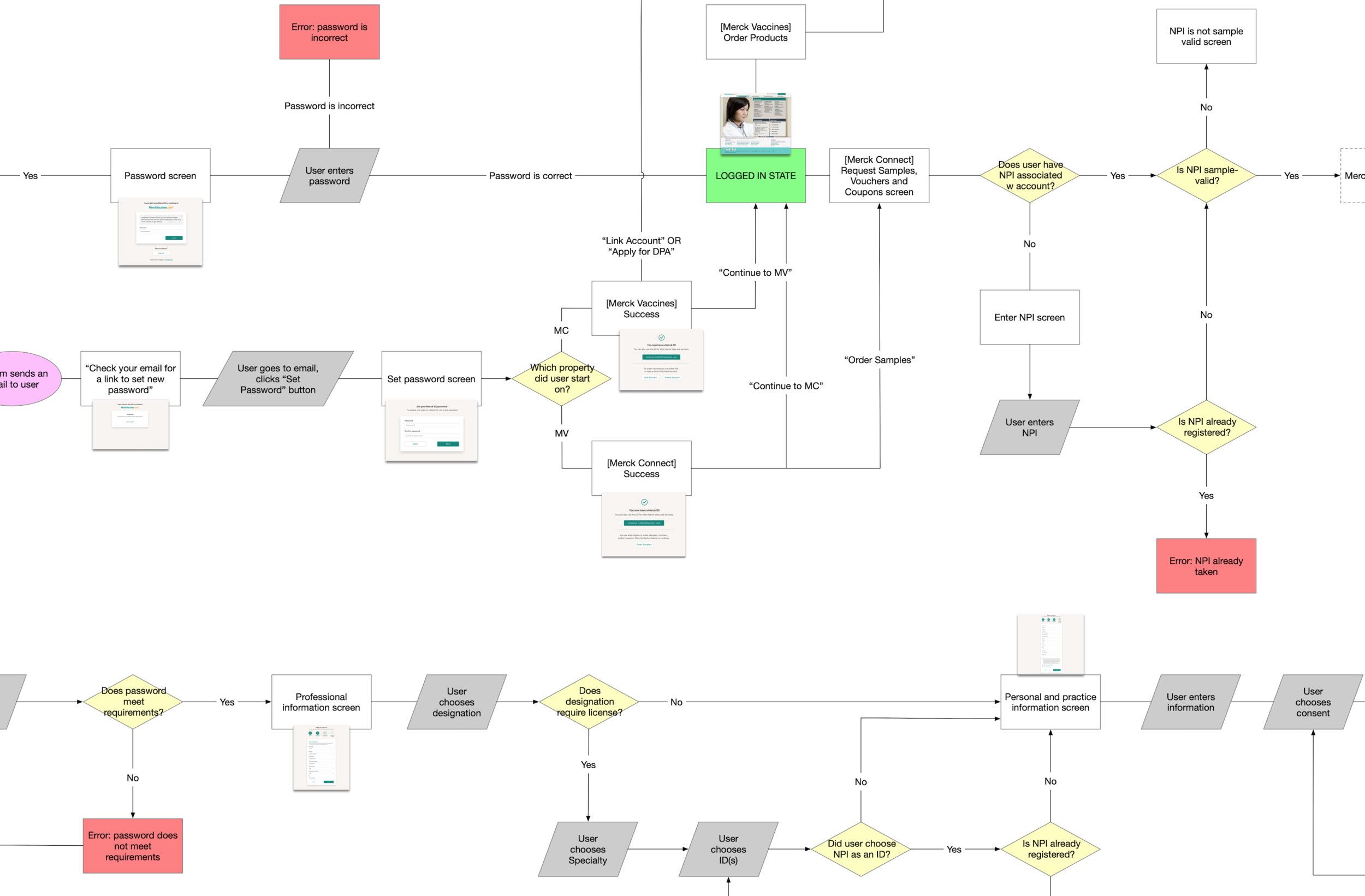
In order to get a better handle on the complexity of the SSO system, I went to Omnigraffle and created a map of the whole system, both for my and for my team’s benefit.
This diagram has a user start in the “Logged Out State”, in the top-left grey oval, and progress along any number of twists and turns based on their circumstances. This diagram also shows screens at each screen step, and those are the screens from our prototype we would be using for user testing.
This map helped a lot!
It was so helpful to finally have a comprehensive top-level view of the system we were creating. It helped us have productive conversations about different happy and unhappy paths the user might take along their journey.
Prototype Design (Round 2)
Working with my team, including my partner in UX design and our UI designer, we created a prototype to facilitate our upcoming round of usability testing.
Handing off to our UI designer was a bit of a challenge, but nothing that routine meetings and a dedicated Slack channel couldn’t fix. We worked closely to put together a prototype that would be functional for our upcoming testing.


Armed with this prototype, we were ready to head for testing.
Usability Testing
Usability testing took place over the span of three days in early March at Schlesinger Associates in Center City, Philadelphia.
Schlesinger had a formal lab-type setup for their testing, which was helpful for our purposes. We used Invision to host the prototype, and we used WebEx to stream the testing computer’s screen while one person facilitated the test and the other sat behind the two-way mirror and took notes.
We tested with 12 individuals, and got a mix of both healthcare professionals (doctors) and healthcare business professionals (office staff), because we knew both might have to use Merck sites at some point in their daily work.
The results of our testing were humbling and surprising.
We learned a lot from our testing, including:
Almost no users actually used multiple Merck sites. It was usually just one.
Most doctors did not use the Merck sites themselves, it was usually their office staff using their credentials to order vaccines or samples.
There was absolutely no confusion on the part of users about what email address they would use for their login, which was something we thought would have really tripped them up.
The moniker “Merck ID” made absolutely no sense to users, and actually confused quite a lot of them.
We used these results to further refine our designs.
Although I was not a part of that phase of the project, as my budgeted hours were drastically reduced due to budgeting reasons.
SSO is now in the implementation phase, with Merck IT putting it into place.
Soon our designs will be what users see on MerckConnect.com and MerckVaccines.com, which is really neat. We helped to improve the experience for users of the site, which they may not notice, but hopefully they’ll have fewer issues with logging in and using Merck sites in the future.
What I Learned
I learned a lot while working on this project. It was the closest I’d ever worked with IT, and definitely the most I’ve worked on what ended up being a project about database fidelity and management. Here are a few things I took away from Merck SSO:
Asking questions is extremely important.
Nobody ever scorned me for asking a question, and with every question answered, I was better able to design accurately.
Create a diagram early.
The workflow diagram I created was so important to my understanding of the system, and once I had it, it was invaluable. I wish I had made it earlier in the project, because that would have shortened the amount of time we had been confused or run around in circles in meetings
Sometimes you don’t even know the right questions to ask, and it can help to bring in a subject-matter expert.
There were plenty of times during the course of this project that my team, as having a UX focus, were completely lost in the deep IT nature of the design. A couple of times, we had burned a ton of hours working out a certain solution to a problem we were focused on, only to be told later that that particular problem didn’t actually exist. It would have benefitted our team to have brought in someone with more of a technical background to help us decode some of the IT quandaries we were stuck on earlier in the process.
When in doubt, pick up a whiteboard marker.
There were countless times during this project that the whiteboard helped our team align on a problem or a design. Whiteboards are there for a reason, and it never hurts just to pick up a marker and start sketching.